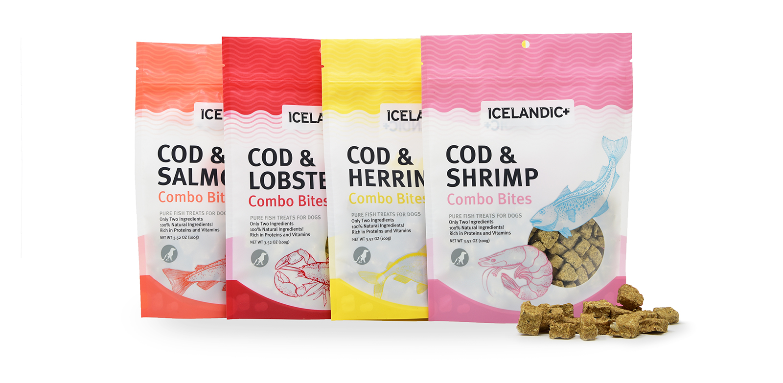
Printing is the moment that packaging design goes from theoretical to very, very real.
When it comes to product packaging in particular, there’s more to consider than just sending a few files to your favorite printer. In fact, mistakes can be quite costly. Getting the most out of your printing budget starts with making informed choices. The main components are the style of printing, the type of ink, the material you’re printing on, and the finishing details.
What Type of Printing is Right for Your Design?
There are five major types of printing available to you, each with a different set of strengths and weaknesses. Choosing one is mostly about deciding what is important to you, and what is possible with your constraints.
Each type of printing commonly used for packaging designs has pros and cons.
Lithographic Printing
Good for: High volume jobs, photo quality images
Not ideal for: Quick turns, small budgets
Flexogrpahic printing
Good for: High volume jobs, 3 colors or less
Not ideal for: Color matching, photo quality images
Digital Printing
Good for: Low volume jobs, quick turns, photo quality graphics
Not ideal for: Color matching
Rotogravure Printing
Good for: Color matching, photo quality graphics
Not ideal for: Quick turns, small budgets
Silkscreen printing
Good for: Low volume jobs
Not ideal for: Photo quality graphics
Getting a firm grasp on your needs early can ensure that your design won’t require a printing method that doesn’t work with the logistical constraints of your project.
Then you can consider the nuances of what your packaging looks like. Are you printing images and want to maintain photo quality? Are there gradients within your design that need to be blended smoothly? How many custom colors will you need to print in? Having a good handle on the different methods of printing will help you make this choice.
Choosing the Right Type of Paper
There’s just as much nuance to selecting the type of paper you’ll want to print your packaging on as there is with the mode of printing. Different paper weights, textures and coatings will affect the way that consumers interact with packaging. Certain papers react differently to their environment — some stand up better to refrigeration, for example.
Both weight and texture for paper have a strong effect on how consumers view your packaging. When it comes to choices between more standard and more textured stock, do make sure you test your design to ensure that textured stock is viable. Certain levels of texture could interfere with the look of design.
You’ll also want to think about coatings. Coated papers prevent high levels of ink from being absorbed into the paper, which results in cleaner lines. If a paper doesn’t have that coating, nothing is standing between it and the ink. This means more ink will be absorbed, and colors and images will be softer and warmer.
The real lesson here is to work closely with the printing company throughout your project. They’ll be able to help you find the right paper option from their selection. Being mindful of how you want your packaging to exist in the world and communicating clearly with the printers are so critical, and can be easily overlooked.
Getting Your Colors Right
Specific types of ink are better suited for certain projects, just as with mode of printing and paper type (seeing a pattern?).
As a rule of thumb, the more colors of ink you use, the more expensive your print job will be. The most basic jobs are done in CMYK, which stands for Cyan, Magenta, Yellow and Key (printer-speak for black). Digital print jobs are done in RGB, which stands for Red, Green, Blue.
These systems use ratios of their core colors to generate the color you want, like mixing paints. Sometimes, it’s also possible to print in the truest form of a color, using the Pantone Matching System, or PMS.
PMS is a set of proprietary colors from Pantone that can be deployed on non-digital printing jobs. They can be used in conjunction with CMYK inks to build a wider breadth of truer colors. You can’t pair PMS custom plates with RGB projects, because they are not available for digital print jobs.

Finished? Not yet!
Silly as it may sound, you can’t be finished until you talk about finishing. These are the last steps that will be required to turn a flat print out into a finished piece of packaging.
The finish work is the seemingly small touch that can make a big difference in the way your packaging looks. Embossing and debossing both create a textured impression, embossing by raising patterns in the material, debossing by indenting those patterns. There’s also foil stamping, where images are applied to the packaging at high heat.
All of these are touches that elevate the look of packaging. They’re an added expense, but can convey a sense of prestige to consumers.
To this point, we’ve been talking about the packaging process in 2D. Now is the time to get proofs from the printer. These can come in physical and digital forms, both of which can be valuable to see before the complete run of printing is done.
Usually, a digital proof will be included with no extra charge. It can be useful to see a physical proof, especially to ensure color is coming through correctly, but this often comes with an extra charge.
Keep an eye out for part III of our Packaging Design 101 series. The last installment will discuss how to set your exact specs and finish your packaging design.

