A trip to the liquor store is a bit more involved now that ready-to-drink options have become a booming trend.
Beyond the bottles of spirits and liqueurs, canned cocktails (not to be confused with malt liquor-based hard seltzers like White Claw) now line the shelves.
Yet, with great trends comes great competition. How are brands claiming their space in the growing market and standing out on the shelves? They’re designing smart, engaging, and strategic labels. Here are some of our favorites that rise to the top.
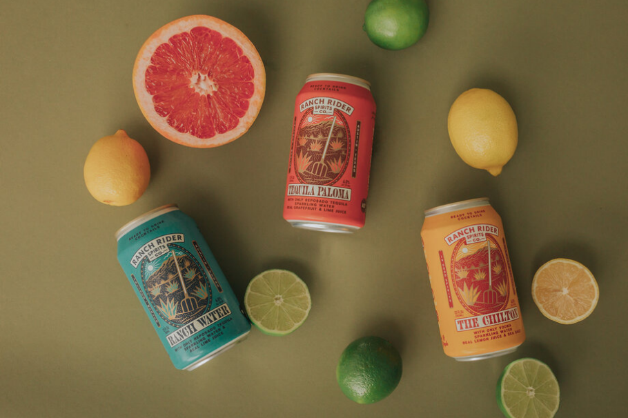
Ranch Rider Spirits

Image courtesy of https://www.ranchriderspirits.com/
Who are they?
Ranch Rider Spirits is an Austin, TX based canned cocktail brand that prides themselves on creating drinks with minimal sugar or artificial sweeteners.
Why do we love their labels?
This brand leans into their native Southwest motif with a regular sized can adorned with illustrations of cacti and a pitchfork. The words on the can proudly call out the simple ingredients, for instance, “with only reposado tequila, sparkling water, real grapefruit and lime juice.”
The logo stays consistent across all cans, with color being the primary change between flavor profiles – and the brightly colored cans (yellow, teal and coral) do well to stand out on shelves.
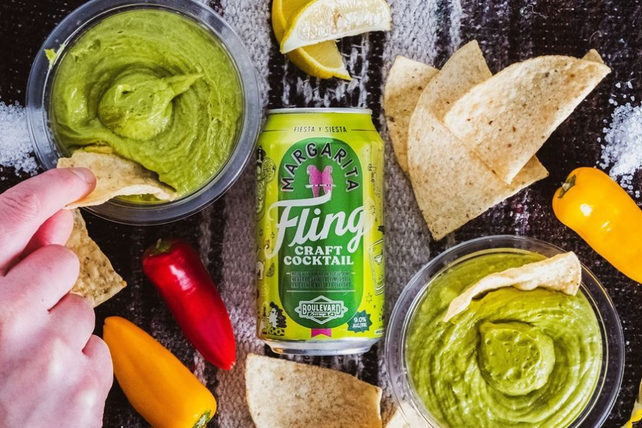
Fling

Image courtesy of https://www.boulevard.com/fling/
Who are they?
Fling is a line of canned cocktails from Kansas City based craft brewer Boulevard Brewing Co.
Why do we love their labels?
Fling’s labels are maybe the most fun canned cocktail labels we’ve seen. Each offering is a popular, oft-ordered cocktail, from the Mai Thai to the Whiskey Mule, and the cans are each designed to showcase the vibe of the cocktail. For instance, the Margarita features illustrations of pinatas, cacti, and lucha libre wrestlers on the back and side of the can.
Every inch of the can is prime real estate for Fling to fill, and they prefer playful to simple. The copy is also unique to each cocktail flavor, though the Fling logo remains front and center on all cans.
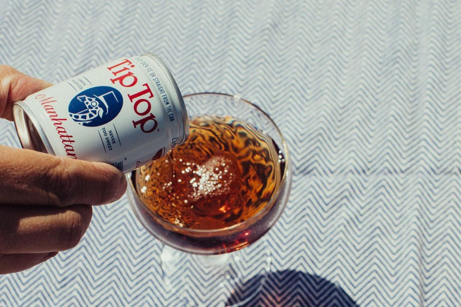
Tip Top

Image courtesy of https://tiptopcocktails.com/
Who are they?
Tip Top are “delicious cocktails in tiny cans” developed by James Beard finalist, Miles Macquarrie.
Why do we love their labels?
Tip Top takes the classic approach with their cocktails. The short, 100ml cans are quite different from most of the ready to drink options on the market. Because of the can’s size, and the fact that they don’t need to be refrigerated, Tip Top beverages can live on the checkout counter vs. in the fridge. That benefit gives them some important retail real estate that other brands don’t have.
Tip Top specializes in classic cocktails (Old Fashioned, Negroni, Daiquiri) rather than seltzer based beverages, and the label reflects a classic vibe for a modern audience—a round serif logo with the cocktail name in cursive. Plus, the Tip Top mascot, featured on the front of every can, is an old-timey giraffe wearing a top hat and a monocle. Which is just awesome.
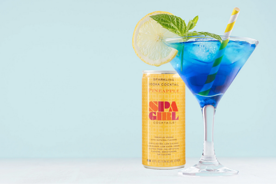
Spa Girl

Image courtesy of https://www.drinkspagirlcocktails.com/
Who are they?
Spa Girl cans premium sparkling vodka cocktails with award-winning taste and pure ingredients.
Why do we love their labels?
There’s no doubt that Spa Girl’s cocktails are marketed towards women. Beyond the obvious name, the logo in pink, orange, and red purposely uses a classically feminine color scheme. The can is also skinny, which aligns with the info on the front of the can highlighting it as a healthy option—low sugar, low carb, vegan, gluten-free, and more. All flavors contain just fruit vodka, cane sugar and water, a refreshingly simple list of ingredients.
What do these canned cocktail labels have in common?
They’re branded with intent.
Looking at this diverse list of brands, they stand out in an increasingly crowded market because they know their audience: their personalities, what they care about, and the aesthetics they like.
Of course, that’s easier said than done. But if you take anything away from this stunning list of packaged drinks, understand that they weren’t designed from thin air. They started with strategy first.
Need a branding partner to help you stand out on the shelves?
